Animations CSS pour Parallax et les jeux

← Le volet web · 87 diapositives · flèches ou clic pour avancer
ANIMATION CSS (pour parallax - et les jeux)
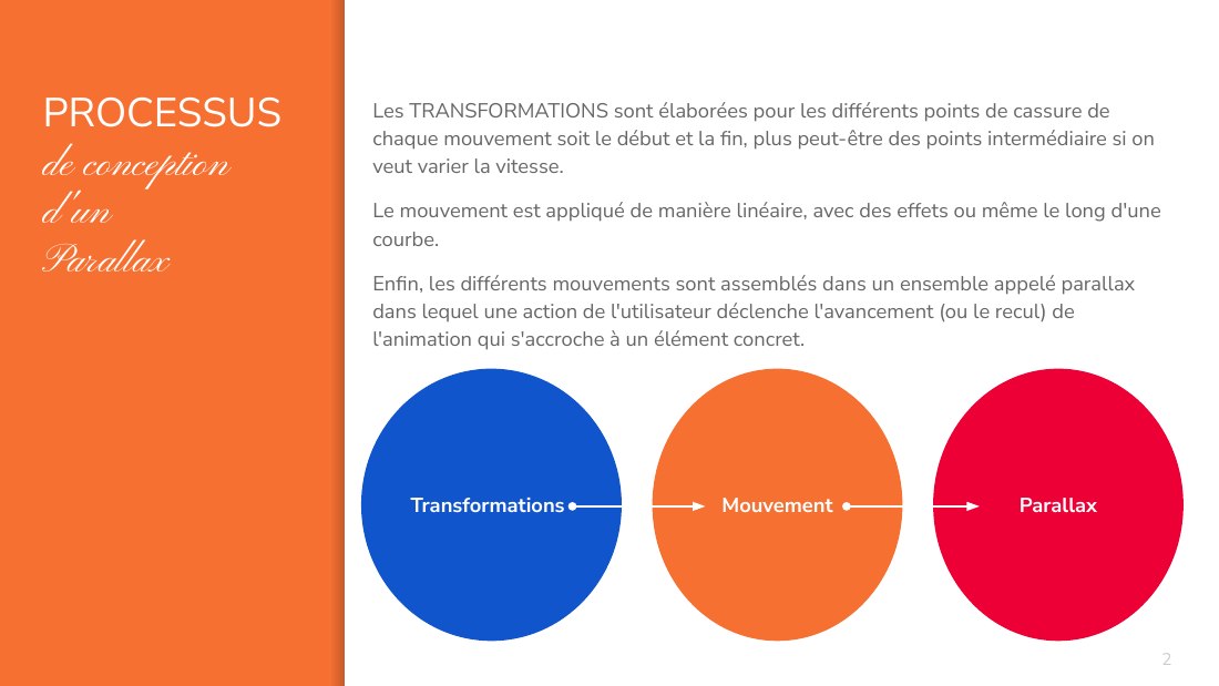
PROCESSUS - de conception d'un - Parallax - Les TRANSFORMATIONS sont élaborées pour les différents points de cassure de chaque mouvement soit le début et la fin, plus peut-être des points intermédiaire si on veut varier la vitesse. - Le mouvement est appliqué de manière linéaire, avec des effets ou même le long d'une courbe. - Enfin, les différents mouvements sont assemblés dans un ensemble…
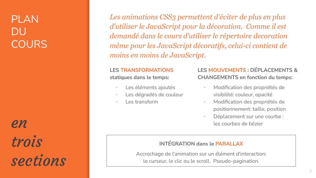
PLAN - DU - COURS - e n - trois - sections - LES TRANSFORMATIONS statiques dans le temps: - Les éléments ajoutés - Les dégradés de couleur - Les transform - INTÉGRATION dans le PARALLAX - Accrochage de l'animation sur un élément d'interaction: le curseur, le clic ou le scroll. Pseudo-pagination. - ‹#› - Les animations CSS3 permettent d'éviter de plus en plus d'utiliser le JavaScript pour la…
The universe is transformation: - life is opinion. - -- Marcus Aurelius - ‹#›
A - LES - TRANS- - FORMATIONS - Statiques - dans le temps - ‹#›
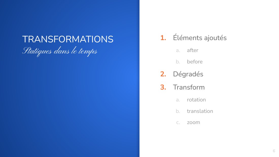
TRANSFORMATIONS - S tatiques dans le temps - Éléments ajoutés - after - before - Dégradés - Transform - r otation - translation - zoom - ‹#›
1. - ÉLÉMENTS - AJOUTÉS - after - et - before - ‹#›
Éléments ajoutés - Les éléments ajoutés sont comme des balises imaginaires, décorables (avec le CSS habituel) et remplissables (par l'attribut content) que l'on fait apparaître AVANT ou APRES des balises qu'on a déjà. - On peut s'en servir pour faire apparaître des décorations plus complexes que des bordures standard autour de notre objet. - ‹#›
Exemple de before - #menu li::before - { - content : " " ; - background-color : orange ; - width:100%; - } - #cible::after - { - content : "" ; - background-color : orange ; - width:100%; - } - ‹#›
Éléments ajoutés - Les éléments ajoutés sont comme des balises imaginaires, décorables (avec le CSS habituel) et remplissables (par l'attribut content) que l'on fait apparaître AVANT ou APRES des balises qu'on a déjà. - On peut s'en servir pour faire apparaître des décorations plus complexes que des bordures standard autour de notre objet. - ‹#›
Applications - http://littlesnippets.net/category/collections/vanessa/ http://codepen.io/littlesnippets/pen/LxRKJm - http://littlesnippets.net/category/collections/harris/ - http://codepen.io/littlesnippets/pen/jVYxEj - https://www.w3schools.com/css/css3_mediaqueries_ex.asp - http://one-div.com/ - ‹#›
2. - DÉGRADÉS - Des dégradés de couleurs peuvent être élaborés dynamiquesments - ‹#›
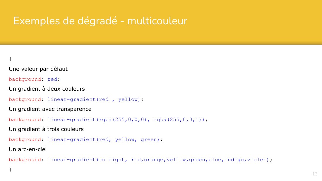
Exemples de dégradé - multicouleur - { - Une valeur par défaut - background : red ; - Un gradient à deux couleurs - background : linear-gradient(red , yellow) ; - Un gradient avec transparence - background : linear-gradient(rgba(255,0,0,0), rgba(255,0,0,1)) ; - Un gradient à trois couleurs - background : linear-gradient(red, yellow, green) ; - Un arc-en-ciel - background : linear-gradient(to…
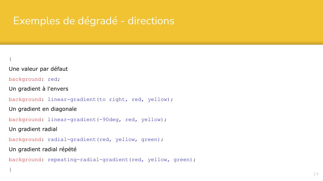
Exemples de dégradé - directions - { - Une valeur par défaut - background : red ; - Un gradient à l'envers - background : linear-gradient(to right, red, yellow) ; - Un gradient en diagonale - background : linear-gradient(-90deg, red, yellow) ; - Un gradient radial - background : radial-gradient(red, yellow, green) ; - Un gradient radial répété - background : repeating-radial-gradient(red, yellow,…
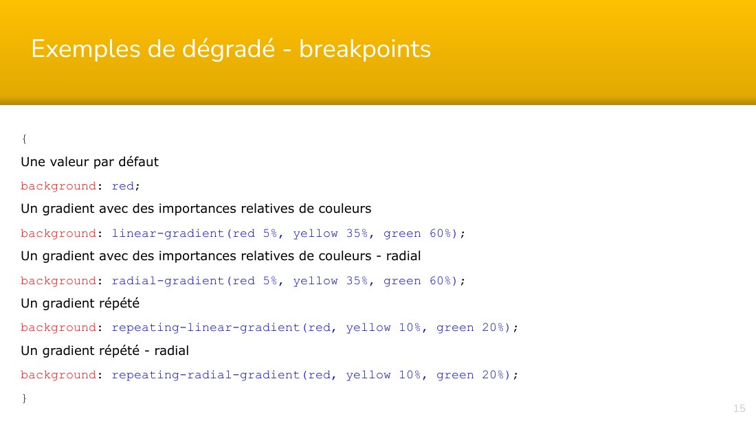
Exemples de dégradé - breakpoints - { - Une valeur par défaut - background : red ; - Un gradient avec des importances relatives de couleurs - background : linear-gradient(red 5%, yellow 35%, green 60%) ; - Un gradient avec des importances relatives de couleurs - radial - background : radial-gradient(red 5%, yellow 35%, green 60%) ; - Un gradient répété - background :…
3 . - TRANSFORM - Rotation, translation et zoom - ‹#›
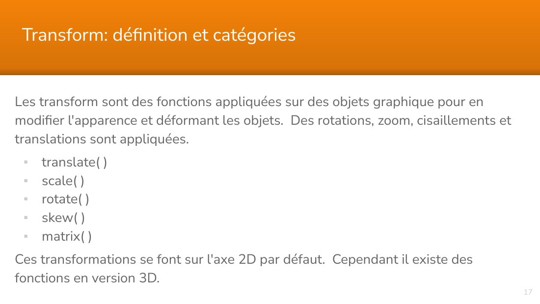
Les transform sont des fonctions appliquées sur des objets graphique pour en modifier l'apparence et déformant les objets. Des rotations, zoom, cisaillements et translations sont appliquées. - translate( ) - scale( ) - rotate( ) - skew( ) - matrix( ) - Ces transformations se font sur l'axe 2D par défaut. Cependant il existe des fonctions en version 3D. - ‹#› - Transform: définition et catégories
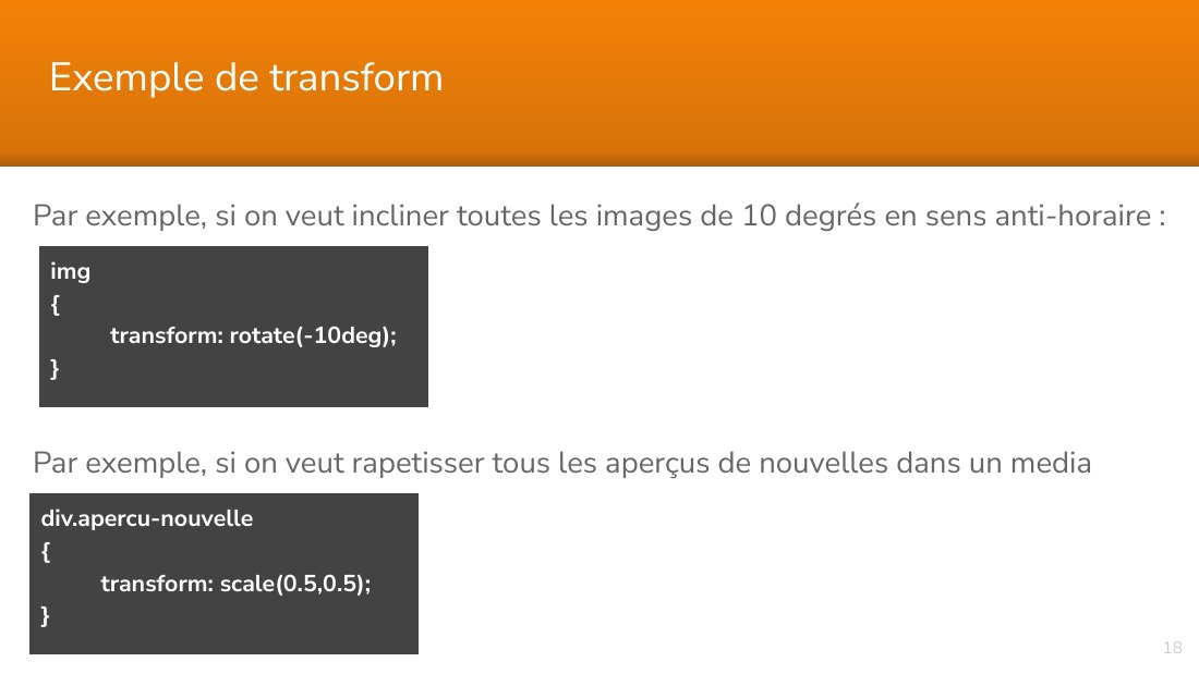
Par exemple, si on veut incliner toutes les images de 10 degrés en sens anti-horaire : - Par exemple, si on veut rapetisser tous les aperçus de nouvelles dans un media query : - ‹#› - Exemple de transform - img - { - transform: rotate(-10deg); } - div.apercu-nouvelle - { - transform: scale(0.5,0.5); }
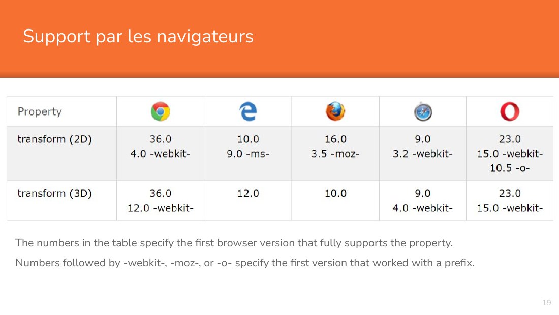
The numbers in the table specify the first browser version that fully supports the property. - Numbers followed by -webkit-, -moz-, or -o- specify the first version that worked with a prefix. - ‹#› - Support par les navigateurs
Démo des transform - http://one-div.com/ - https://codepen.io/pen/ - https://www.w3schools.com/w3css/w3css_icons.asp - Logos - http://www.bchanx.com/logos-in-pure-css - https://codepen.io/PanKex/pen/qdvnK - http://www.responsivelogos.co.uk/ - http://www.ecsspert.com/css3-logos/adidas-originals#project - ‹#›
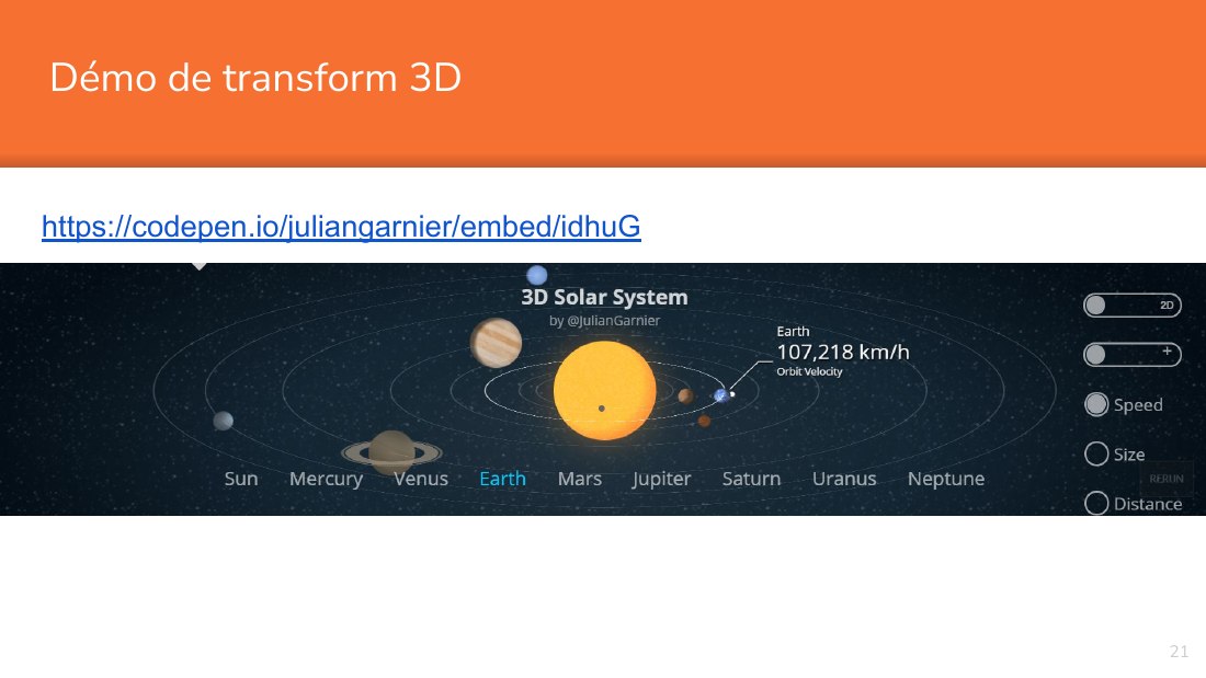
Démo de transform 3D - https://codepen.io/juliangarnier/embed/idhuG - ‹#›
MOUVEMENTS - Déplacements & changements En fonction du temps - Apparitions: modification des propriétés de visibilité - couleur - o pacité - Déplacements: modification des propriétés de positionnement - taille - position - Déplacement sur une courbe - ‹#›
1 . - APPARITION - Modification des propriétés de visibilité ou de couleurs - ‹#›
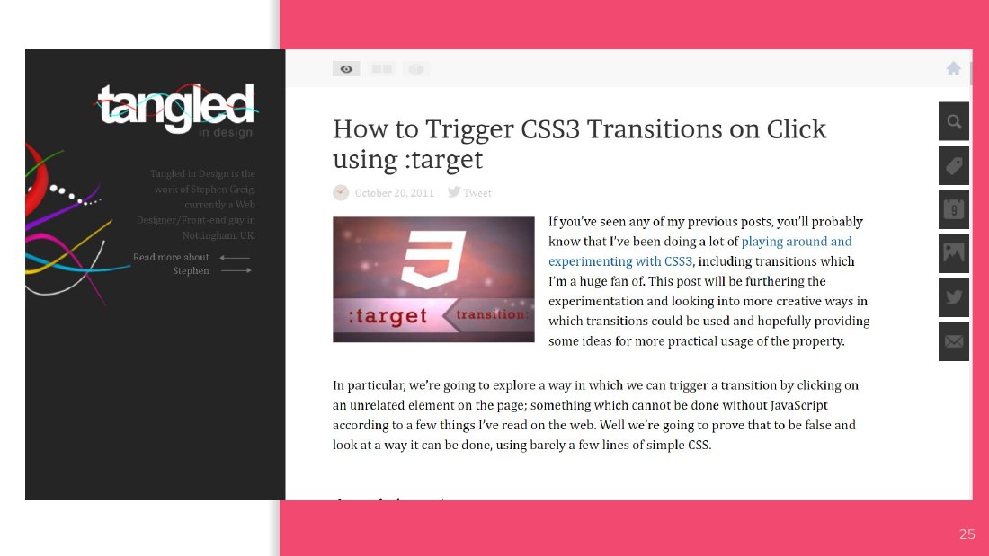
APPARITION - Lors du déclenchement d'un événement CSS, par exemple le :hover, on peut faire apparaître des éléments supplémentaires. On peut aussi la déclencher par un click avec :target ou sur :focus. C'est la propriété CSS 'transition' qui permet de définir une animation avec fondu ainsi déclenchée. Notez aussi la propri été 'animation'. - L'apparition ou disparition s'opère en jouant sur la…
APPARITION - ‹#›
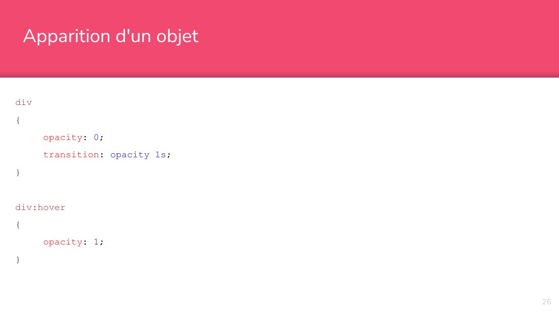
Apparition d'un objet - div - { - opacity : 0 ; - transition : opacity 1s ; - } - div:hover - { - opacity : 1 ; - } - ‹#›
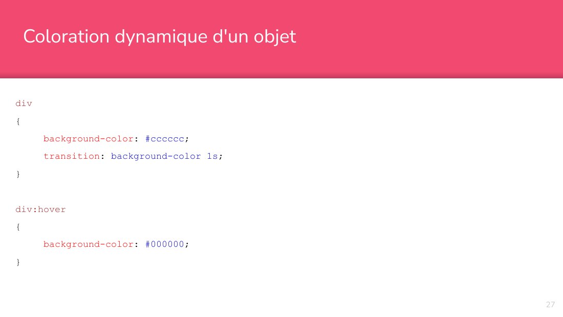
Coloration dynamique d'un objet - div - { - background-color : #cccccc ; - transition : background-color 1s ; - } - div:hover - { - background-color : #000000 ; - } - ‹#›
2. - DÉPLACEMENT - Modification des propriétés de positionnement dans le temps - ‹#›
DÉPLACE - MENT - Lors du déclenchement d'un événement CSS, par exemple le :hover, on peut faire apparaître des éléments supplémentaires. On peut aussi la déclencher par un click avec :target ou sur :focus. C'est la propriété CSS 'transition' qui permet de définir une animation ainsi déclenchée. - Le déplacement s'opère en jouant sur les propriétés 'top' ou 'left' et le dimensionnement avec…
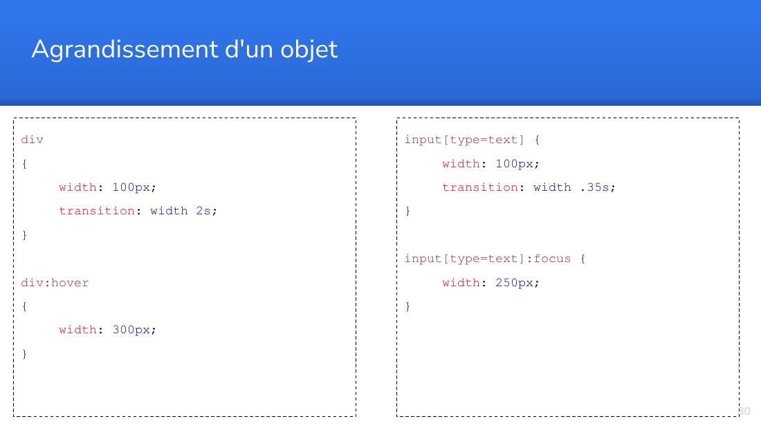
Agrandissement d'un objet - div - { - width : 100px ; - transition : width 2s ; - } - div:hover - { - width : 300px ; - } - ‹#› - input[type=text] { - width : 100px ; - transition : width .35s ; - } - input[type=text]:focus { - width : 250px ; - }
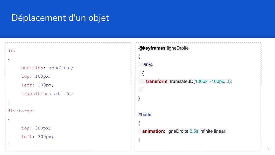
div - { - position : absolute ; - top : 100px ; - left : 100px ; - transition : all 2s ; - } - div:target - { - top : 300px ; - left : 300px ; - } - Déplacement d'un objet - ‹#› - @keyframes ligneDroite - { 50 % - { transform : translate3D( 100px , -100px , 0 ); } } #balle - { animation : ligneDroite 2.5s infinite linear; }
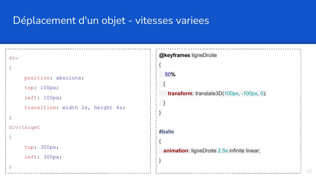
div - { - position : absolute ; - top : 100px ; - left : 100px ; - transition : width 2s, height 4s ; - } - div:target - { - top : 300px ; - left : 300px ; - } - Déplacement d'un objet - vitesses variees - ‹#› - @keyframes ligneDroite - { 50 % - { transform : translate3D( 100px , -100px , 0 ); } } #balle - { animation : ligneDroite 2.5s infinite linear; }
3 . - COURBES - Les courbes de bézier peuvent dessiner des formes vectorielles. - ‹#›
Drawing is putting a line around an idea. - -- Inconnu - Each fresh peak ascended teach something. - -- Sir Martin Conway - ‹#›
Pure mathematics is, in its way, - the poetry of logical ideas. - -- Albert Einstein - Mathematics is the music of reason. - -- James Joseph Sylvester - ‹#›
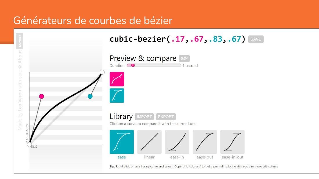
Générateurs de courbes de bézier - ‹#›
Introductions aux courbes de bézier - https://www3.nd.edu/~gconant/misc/bezier/ - https://pomax.github.io/bezierinfo/#pointcurves - http://mathworld.wolfram.com/BezierCurve.html - https://en.wikipedia.org/wiki/B%C3%A9zier_curve - http://www.create-games.com/article.asp?id=1866 - ‹#›
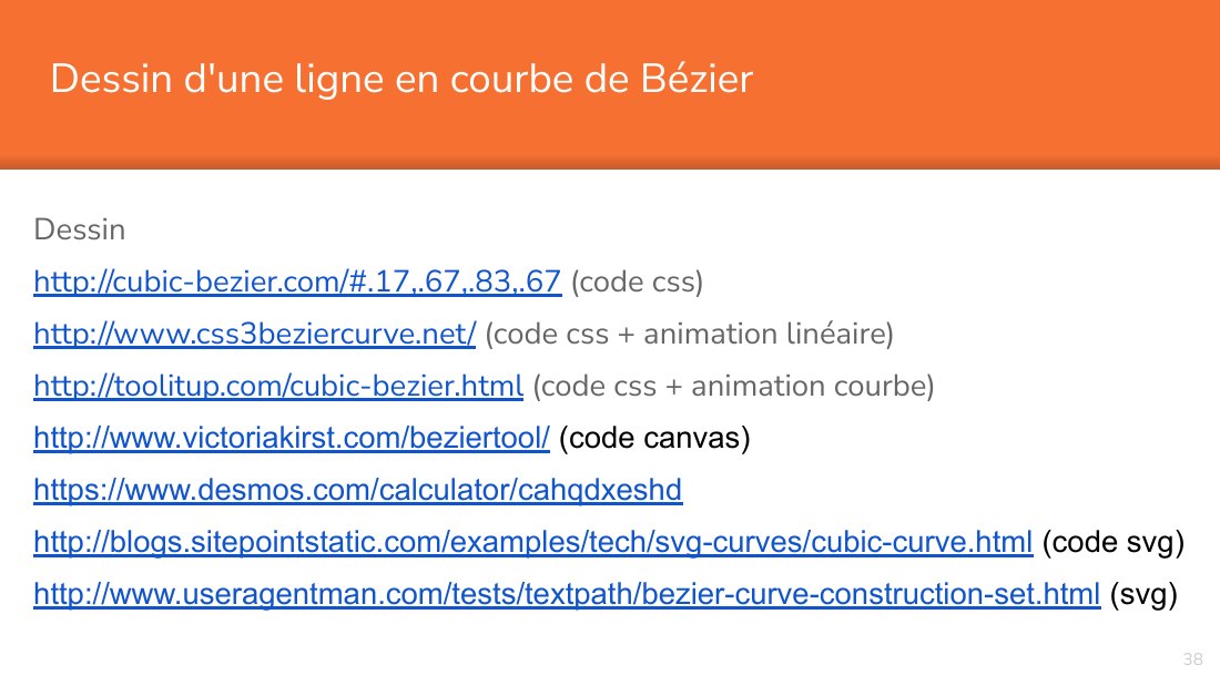
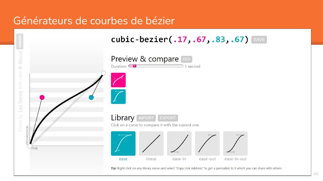
Dessin d'une ligne en courbe de Bézier - Dessin - http://cubic-bezier.com/#.17,.67,.83,.67 (code css) - http://www.css3beziercurve.net/ (code css + animation linéaire) - http://toolitup.com/cubic-bezier.html (code css + animation courbe) - http://www.victoriakirst.com/beziertool/ (code canvas) - https://www.desmos.com/calculator/cahqdxeshd -…
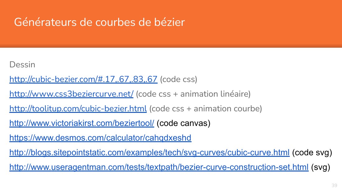
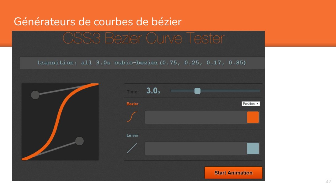
Générateurs de courbes de bézier - Dessin - http://cubic-bezier.com/#.17,.67,.83,.67 (code css) - http://www.css3beziercurve.net/ (code css + animation linéaire) - http://toolitup.com/cubic-bezier.html (code css + animation courbe) - http://www.victoriakirst.com/beziertool/ (code canvas) - https://www.desmos.com/calculator/cahqdxeshd -…
Tutoriels applications courbes bézier - https://www.sitepoint.com/html5-svg-cubic-curves/ - https://www.sitepoint.com/html5-svg-quadratic-curves/ - https://www.sitepoint.com/svg-path-element/ - http://www.useragentman.com/blog/2013/05/20/cross-browser-svg-text-paths-without-javascript-even-in-older-ie/ - ‹#›
Animations le long d'une courbe - http://www.hongkiat.com/blog/css-cubic-bezier/ - http://tobiasahlin.com/blog/curved-path-animations-in-css/ - https://www.khanacademy.org/partner-content/pixar/animate/ball/p/animation-with-bezier-curves - ‹#›
3. - COURBES - Les courbes de bézier peuvent dessiner des formes vectorielles. - ‹#›
Everyone knows what a curve is, until he has studied enough mathematics to become confused through the countless number of possible exceptions. - -- Felix Klein - ‹#›
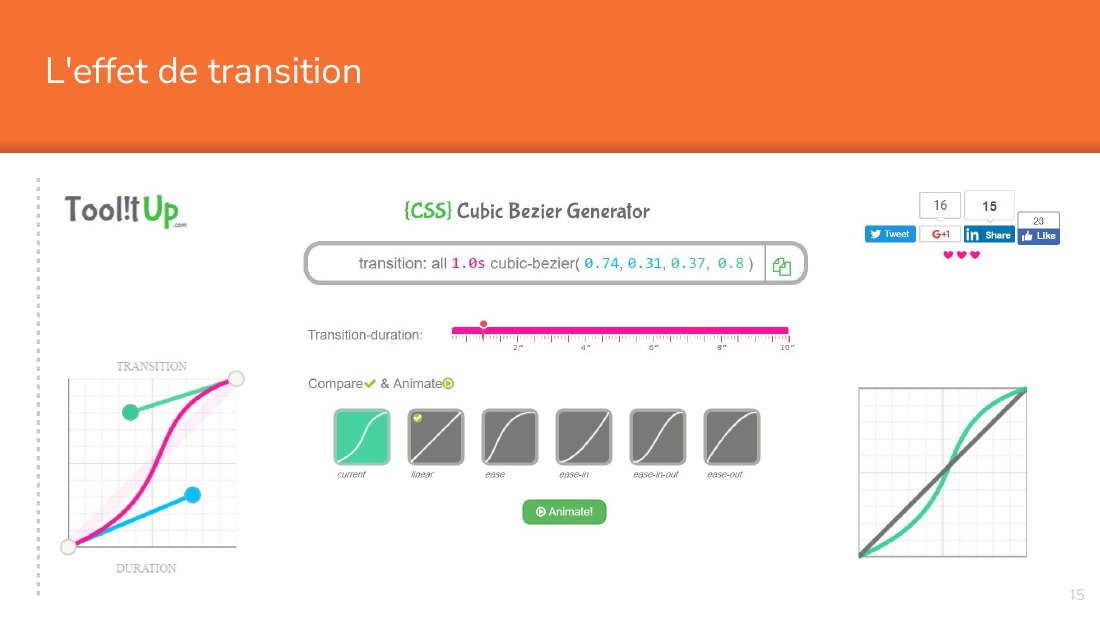
L'effet de transition - La transition standard - http://easings.net/fr - La transition en courbe de Bézier - http://cubic-bezier.com/#.17,.67,.83,.67 - https://matthewlein.com/ceaser/ - http://www.css3beziercurve.net/ - http://toolitup.com/cubic-bezier.html - http://callmenick.com/post/level-up-your-css-animations-with-cubic-bezier -…
L'effet de transition - ‹#›
Générateurs de courbes de bézier - ‹#›
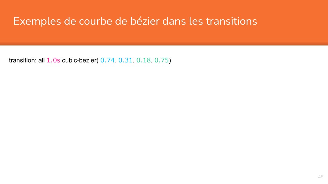
Exemples de courbe de bézier dans les transitions - transition: all 1.0s cubic-bezier( 0.74 , 0.31 , 0.18 , 0.75 ) - ‹#›
Tutoriels applications easing - https://www.smashingmagazine.com/2016/08/css-animations-motion-curves/ - ‹#›
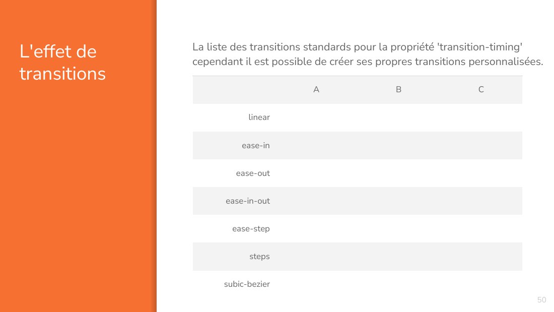
L'effet de transitions - A - B - C - linear - ease-in - ease-out - ease-in-out - ease-step - steps - subic-bezier - ‹#› - La liste des transitions standards pour la propriété 'transition-timing' cependant il est possible de créer ses propres transitions personnalisées.
Vulgarisations animées des courbes de bézier - Dessin - https://www.geogebra.org/m/jUdyR9Ur - Déplacement - http://tholman.com/bezier-curve-simulation/ - https://www.khanacademy.org/partner-content/pixar/animate/ball/p/animation-with-bezier-curves - ‹#›
Do not worry about your difficulties in Mathematics. I can assure you mine are still greater. - -- Albert Einstein - ‹#›
Beauty is the first test: there is no permanent place in the world for ugly mathematics. - -- G. H. Hardy - ‹#›
Le PARALLAX - Ces nouveaux 'splash screen' sont plus utilisés dans les promotions, url virales, pages d'atterrissage. On ne les place plus sur les pages d'accueil en général. - ‹#›
PARALLAX - Intégration des transformations et des changements dans - une animation - Accrochage de l'animation sur un élément d'interaction - c urseur - c lic - s croll - Pseudo-pagination - ‹#›
2 . - PSEUDO- - PAGINATION - Let’s start with the first set of slides - ‹#›
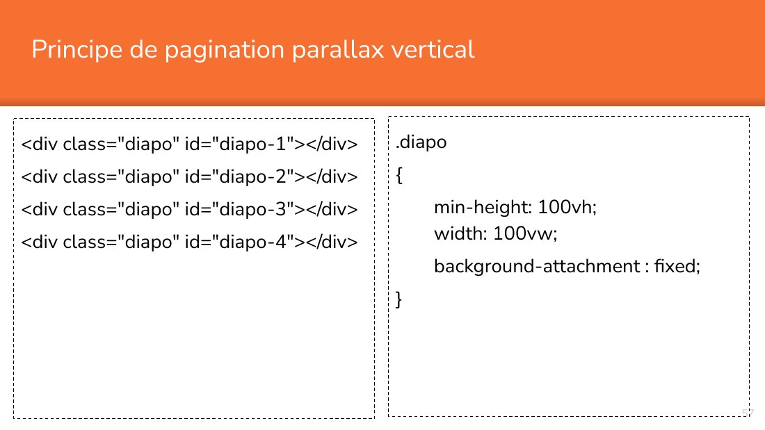
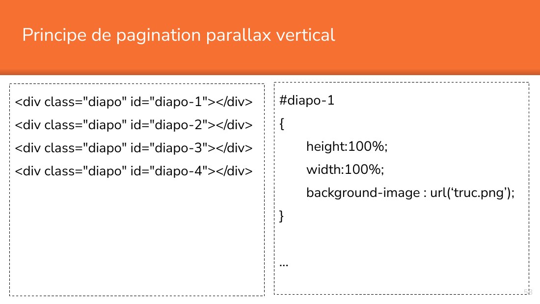
Principe de pagination parallax vertical - <div class="diapo" id="diapo-1"></div> - <div class="diapo" id="diapo-2"></div> - <div class="diapo" id="diapo-3"></div> - <div class="diapo" id="diapo-4"></div> - ‹#› - .diapo - { - min-height: 100vh; width: 100vw; - background-attachment : fixed; - }
Principe de pagination parallax vertical - <div class="diapo" id="diapo-1"></div> - <div class="diapo" id="diapo-2"></div> - <div class="diapo" id="diapo-3"></div> - <div class="diapo" id="diapo-4"></div> - ‹#› - # diapo-1 - { - h eight:100%; - width:100%; - background-image : url(‘truc.png’); - } - ...
Exemples de parallax - https://www.w3schools.com/howto/howto_css_parallax.asp - https://davidwalsh.name/parallax - https://davidwalsh.name/demo/parallax.php - http://codepen.io/stefanjudis/pen/nrzHI - https://codepen.io/keithclark/embed/JycFw - http://codepen.io/keithclark/pen/JycFw - ‹#›
Place your screenshot here - ‹#› - Android Project - Show and explain your web, app or software projects using these gadget templates.
Place your screenshot here - ‹#› - iPhone Project - Show and explain your web, app or software projects using these gadget templates.
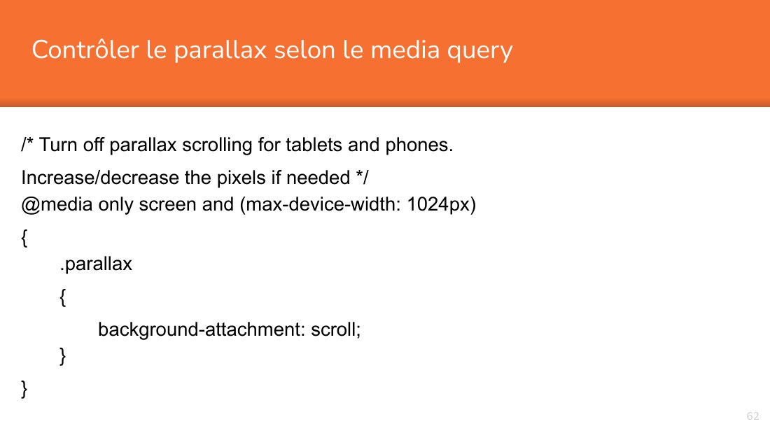
Contrôler le parallax selon le media query - /* Turn off parallax scrolling for tablets and phones. - Increase/decrease the pixels if needed */ @media only screen and (max-device-width: 1024px) - { .parallax - { - background-attachment: scroll; } - } - ‹#›
BONNE - ANIMATION ! - ‹#›
Presentation design - This presentation uses the following typographies and colors: - Titles: Nunito sans - Body copy: Nunito sans - You can download the font on this page: - https://fontlibrary.org/en/font/nunito-sans - Orange #f67031 - Yellow #ffa400 - Fucsia #ed0036 - You don’t need to keep this slide in your presentation. It’s only here to serve you as a design guide if you need to create new…
Credits - Special thanks to all the people who made and released these awesome resources for free. - ‹#› - Presentation template by SlidesCarnival - Photographs by Unsplash - Learn more about slidedocs at duarte.com/slidedocs
Try to c ommunicate ideas visually using graphs, icons, illustrations, photos… any resource that helps you convey your message at a glance. - You can also split your content - White - Is the color of milk and fresh snow, the color produced by the combination of all the colors of the visible spectrum. - ‹#› - Black - Is the color of coal, ebony, and of outer space. It is the darkest color, the…
You can also split your content
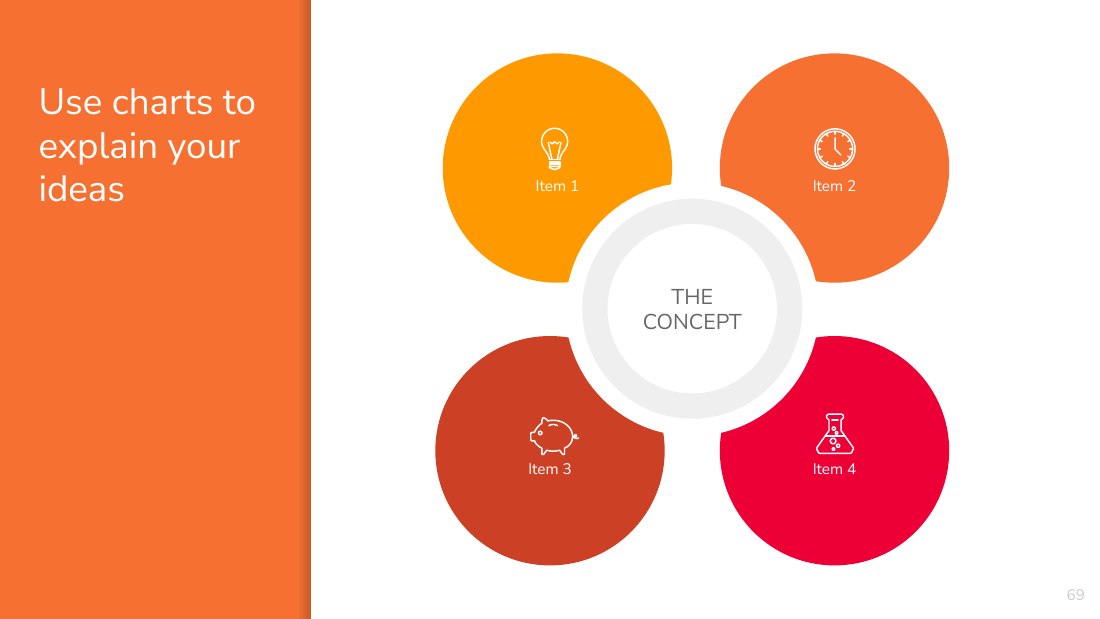
Use charts to explain your ideas - ‹#› - Item 1 - Item 2 - Item 3 - Item 4 - THE - CONCEPT
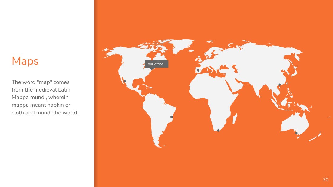
Maps - our office - ‹#› - The word "map" comes from the medieval Latin Mappa mundi, wherein mappa meant napkin or cloth and mundi the world.
89,526,124 - Whoa! That’s a big number, aren’t you proud? - ‹#›
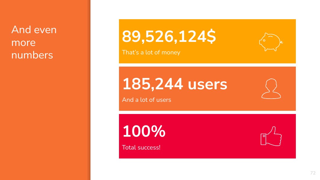
‹#› - And even more numbers - 89,526,124$ - That’s a lot of money - 185,244 users - And a lot of users - 100% - Total success!
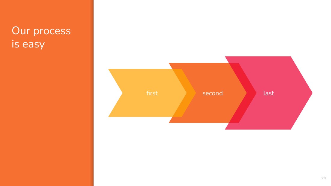
Our process is easy - second - ‹#› - last - first
Let’s review some concepts - Yellow - Is the color of gold, butter and ripe lemons. In the spectrum of visible light, yellow is found between green and orange. - Blue - Is the colour of the clear sky and the deep sea. It is located between violet and green on the optical spectrum. - Red - Is the color of blood, and because of this it has historically been associated with sacrifice, danger and…
“Animation can explain whatever the mind of man can conceive. This facility makes it the most versatile and explicit means of communication yet devised for quick mass appreciation.” - -- Walt Disney Company - ‹#›
Animation offers a medium of story telling and visual entertainment which can bring pleasure and information to people of all ages everywhere in the world. - -- Walt Disney - ‹#›
The butterfly counts not months but moments, - and has time enough. - -- Rabindranath Tagore - ‹#›
Float like a butterfly, - sting like a bee. - -- Muhammad Ali - ‹#›
There is nothing in a caterpillar - that tells you it's going to be a butterfly. - -- R. Buckminster Fuller - ‹#›
Animation is not the art of drawings that move but the art of movements that are drawn. - -- Norman McLaren - ‹#›
Very few people have made the transition from animation to live-action; I'm certainly not one. - -- Henry Selick - ‹#›
The shortest distance between two points is a straight line. - -- Archimede - For time is the longest distance between two places . - -- Tennessee William - ‹#›
Fashion fades, - only style remains the same. - -- Coco Chanel - ‹#›
Animation is about creating the illusion of life. And you can't create it if you don't have one. - -- Brad Bird - ‹#›
The nice thing about animation is that you can realise your inventions without understanding all the hard theory. - -- Nick Park Nice - ‹#›
Nothing's occurring in animation - you manufacture everything. - -- Gore Verbinski - ‹#›
The animation of the canvas is one of the hardest problems of painting. - -- Alfred Sisley - ‹#›